


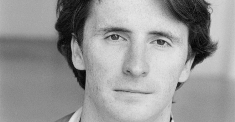
Robert Barta
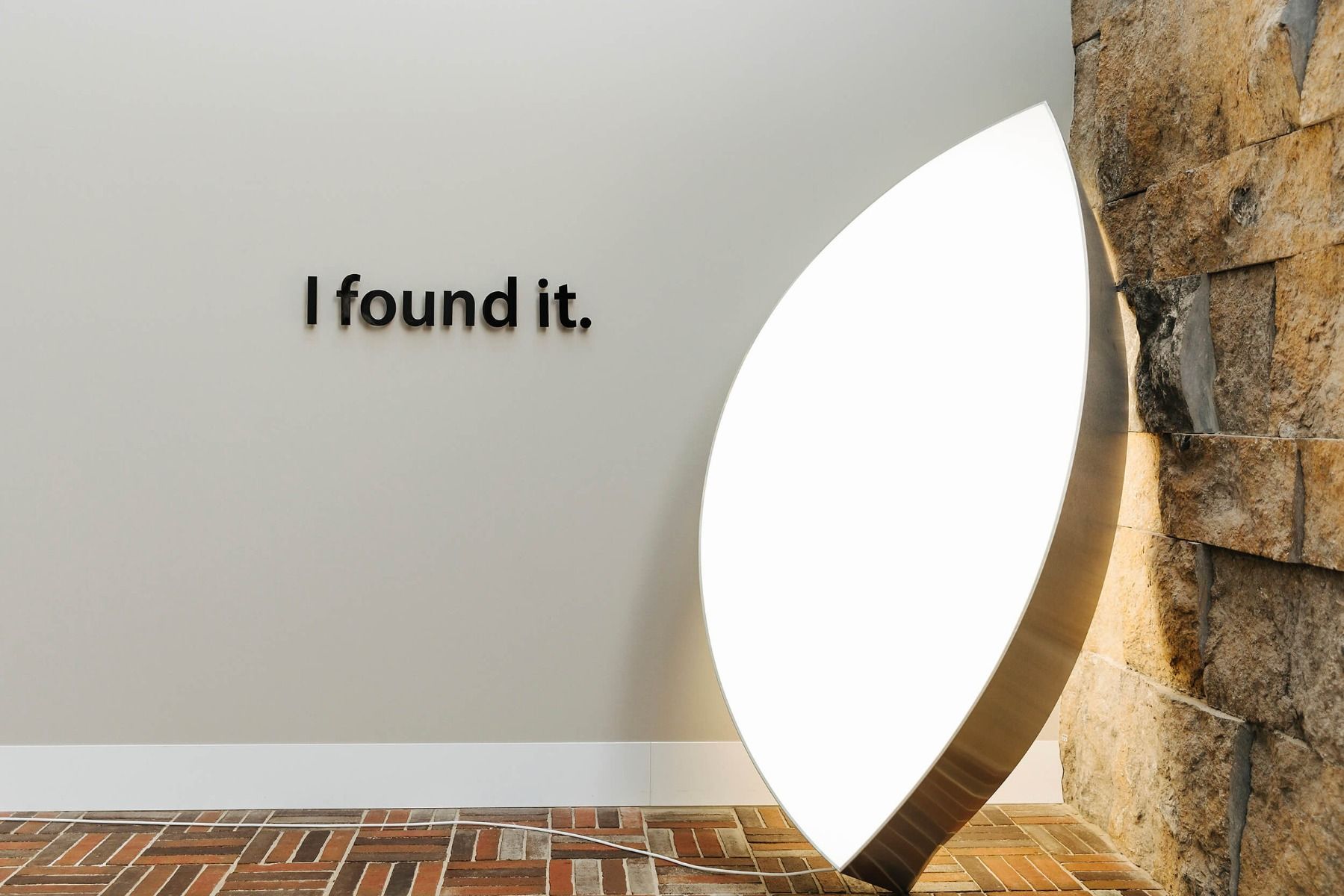
I found it
Would you like to own this artwork?
You could put it in your room. Yes, it is a bit big, but it could go on the balcony or in the bathroom.
Man of the world
Born in the Czech Republic, Robert studied at art schools in Munich and San Francisco. He now lives and works in Berlin.
Apple
The Apple logo was designed in 1977 by graphic designer Rob Janoff. "I took the bite out of the apple in the design, so it would look like an apple and not a cherry or a tomato. There's something iconic about taking a bite out of an apple. Everyone can do it, it goes beyond cultures. If you've ever bitten into an apple, then this is what you got," says Rob. When the design was finished, Rob's boss told him that 'byte' was a computer term, a unit of information. Rob thought this was cool, but it was pure coincidence, not something he had done deliberately.
Robert found it!
Robert likes to create art about subjects that everyone is familiar with. In other words, he likes to redesign objects that we are all aware of. However, he wants to give his own twist to them, which is what he's done with this missing piece from the Apple logo. He calls it changing the DNA. Robert has given this work an appropriate title: ‘I found it’.
Meaning
Small adjustments and word plays change the essence of familiar things or situations. This artwork is a good example. By looking at Apple in a different way, the meaning is changed. And by twisting objects around, you could say that we get to see something of their makeup or, yes, their DNA. Robert says that what he does reveals the contradictions and tensions that give objects ‘life’ or significance. Their ‘secret’ is revealed and the mystery is gone.
What would you like to redesign?
There are lots of famous companies. But perhaps you would have more fun changing the design of something that's not so well known: your school, your favourite shop or the logo of the shopping centre in your town.
Dit is een eerste kijktip in het Engels